Axyn Brand Identity and Logo Design for a Software Company
Brand identity and logo design for an automation software company: a geometric arrow mark and clean wordmark that work from an app icon to a subway poster.

Full Presentation
12 images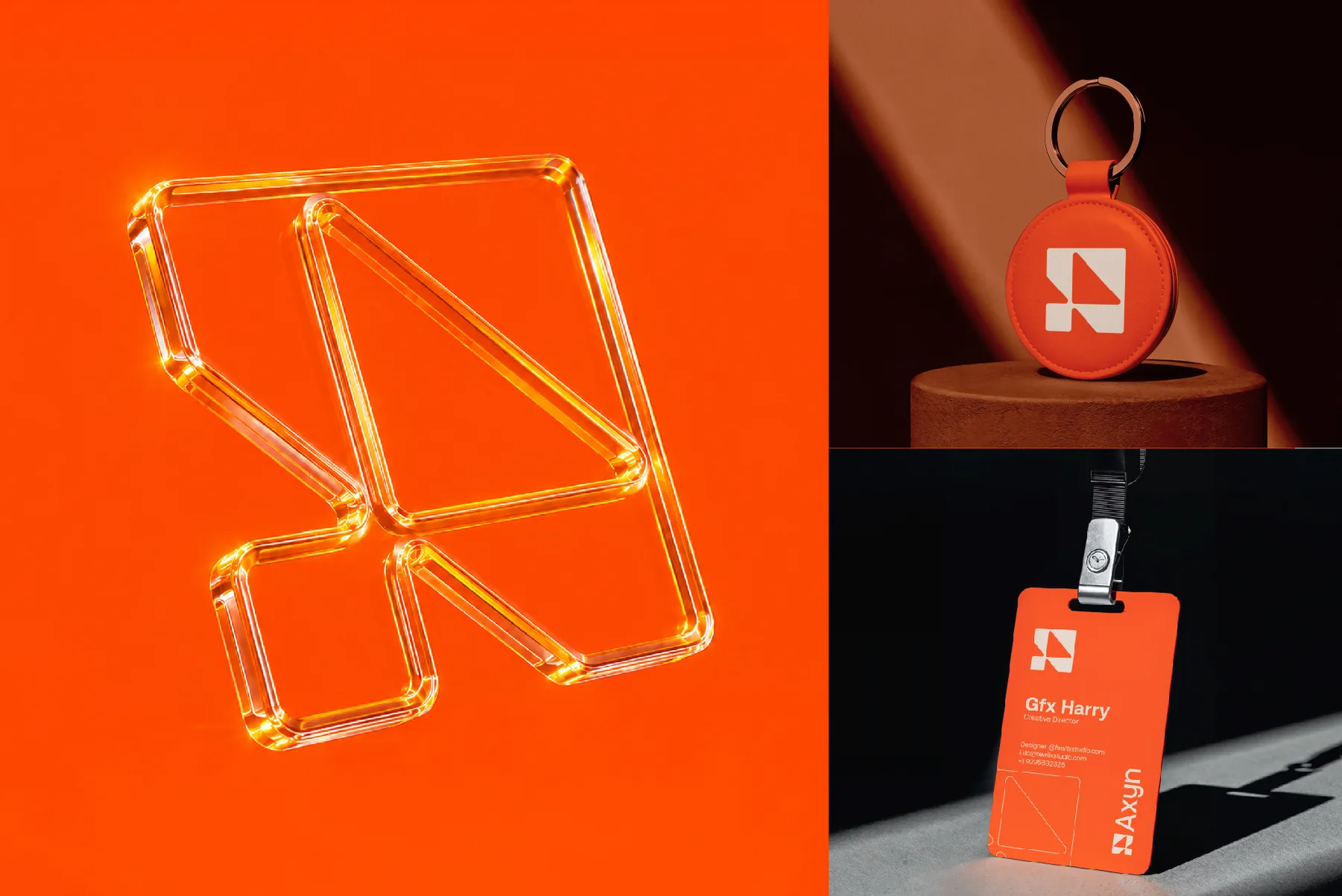

Project Overview
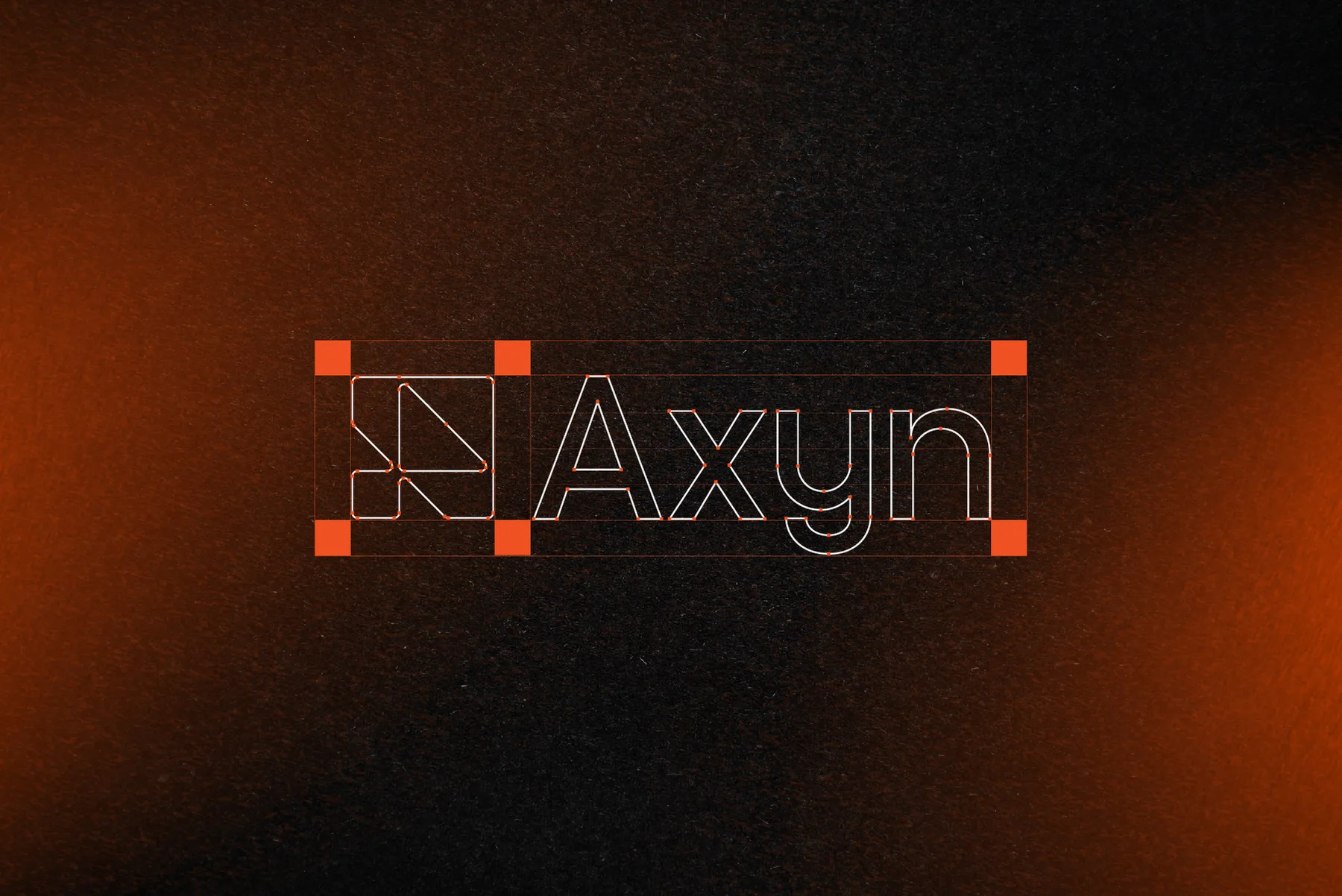
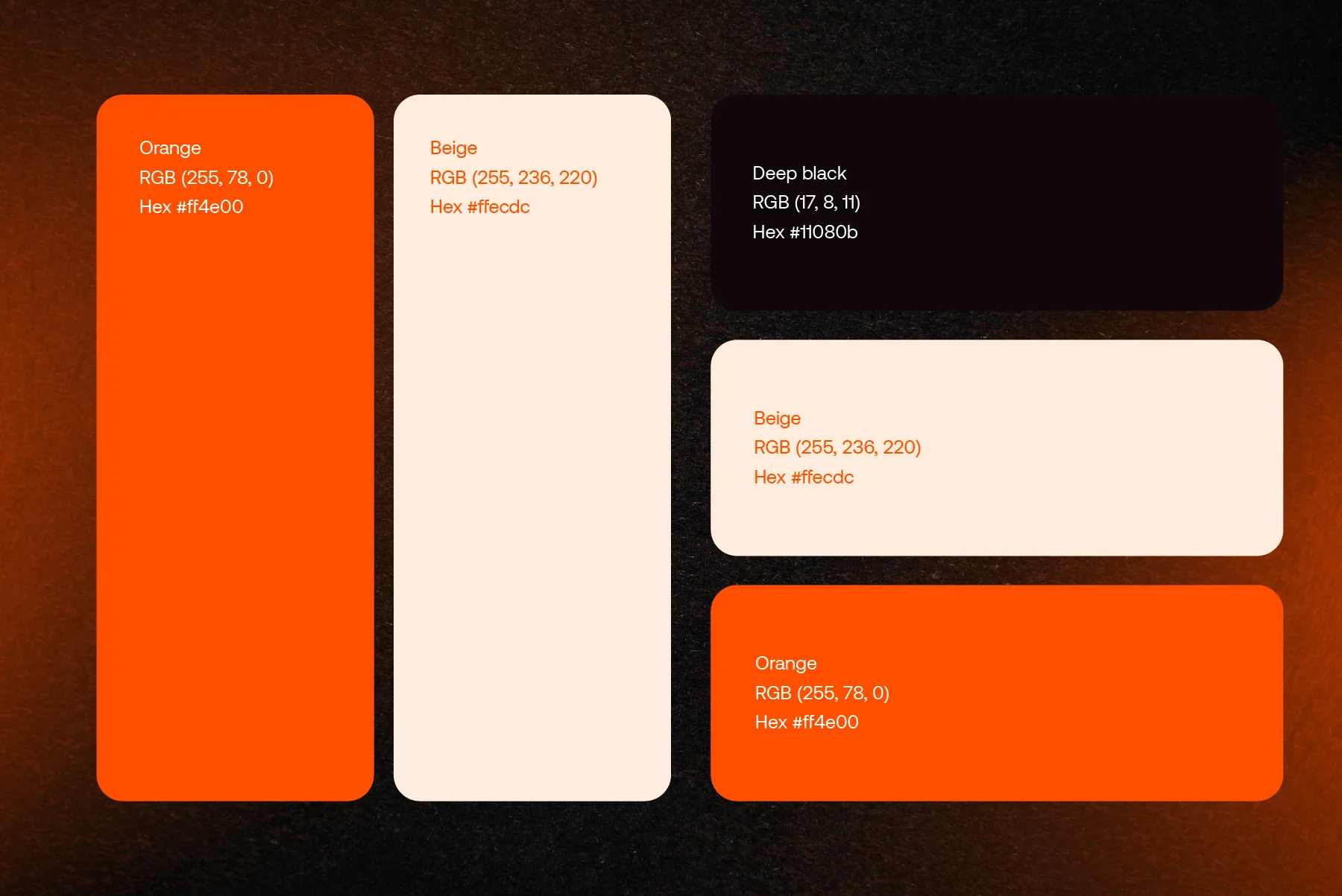
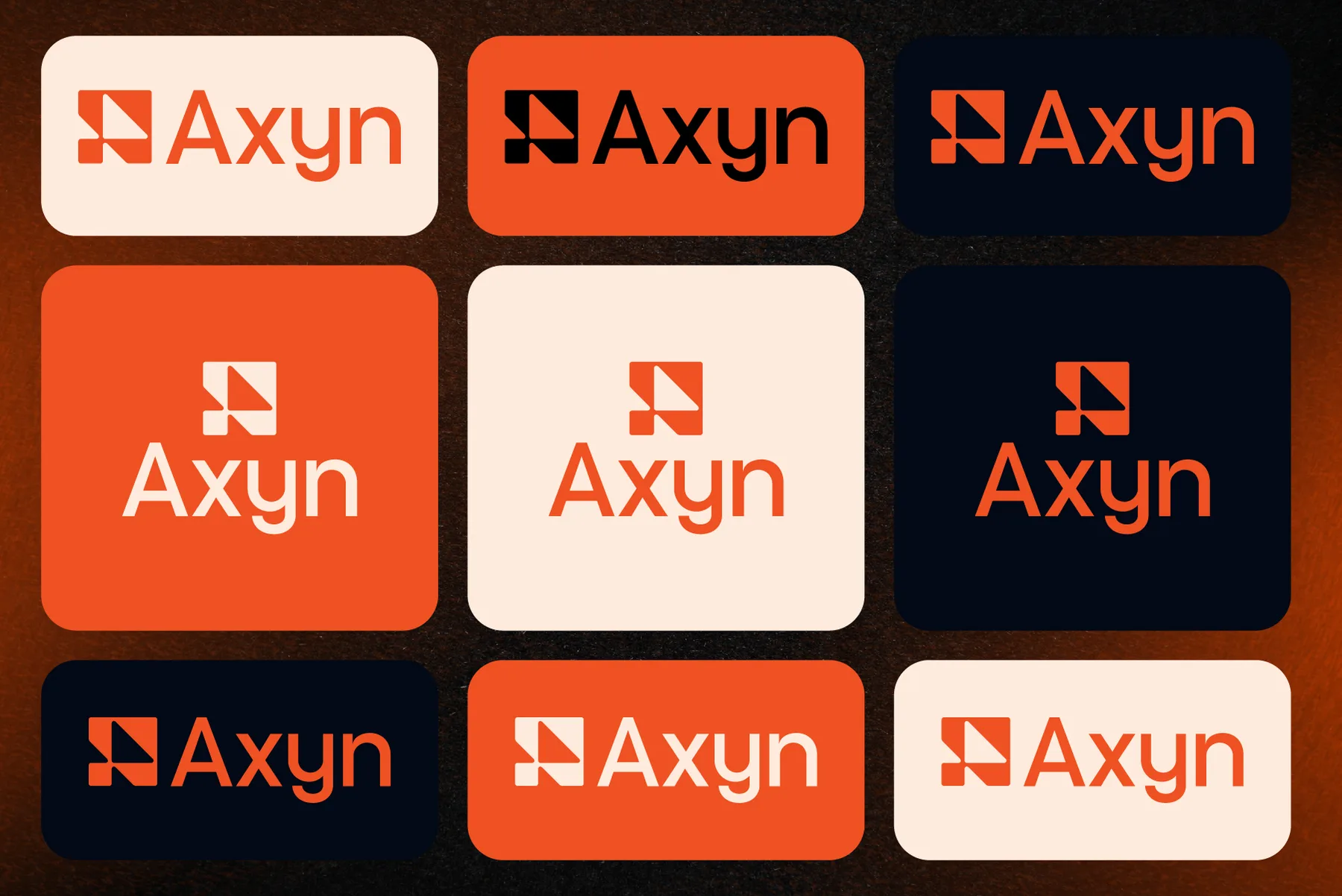
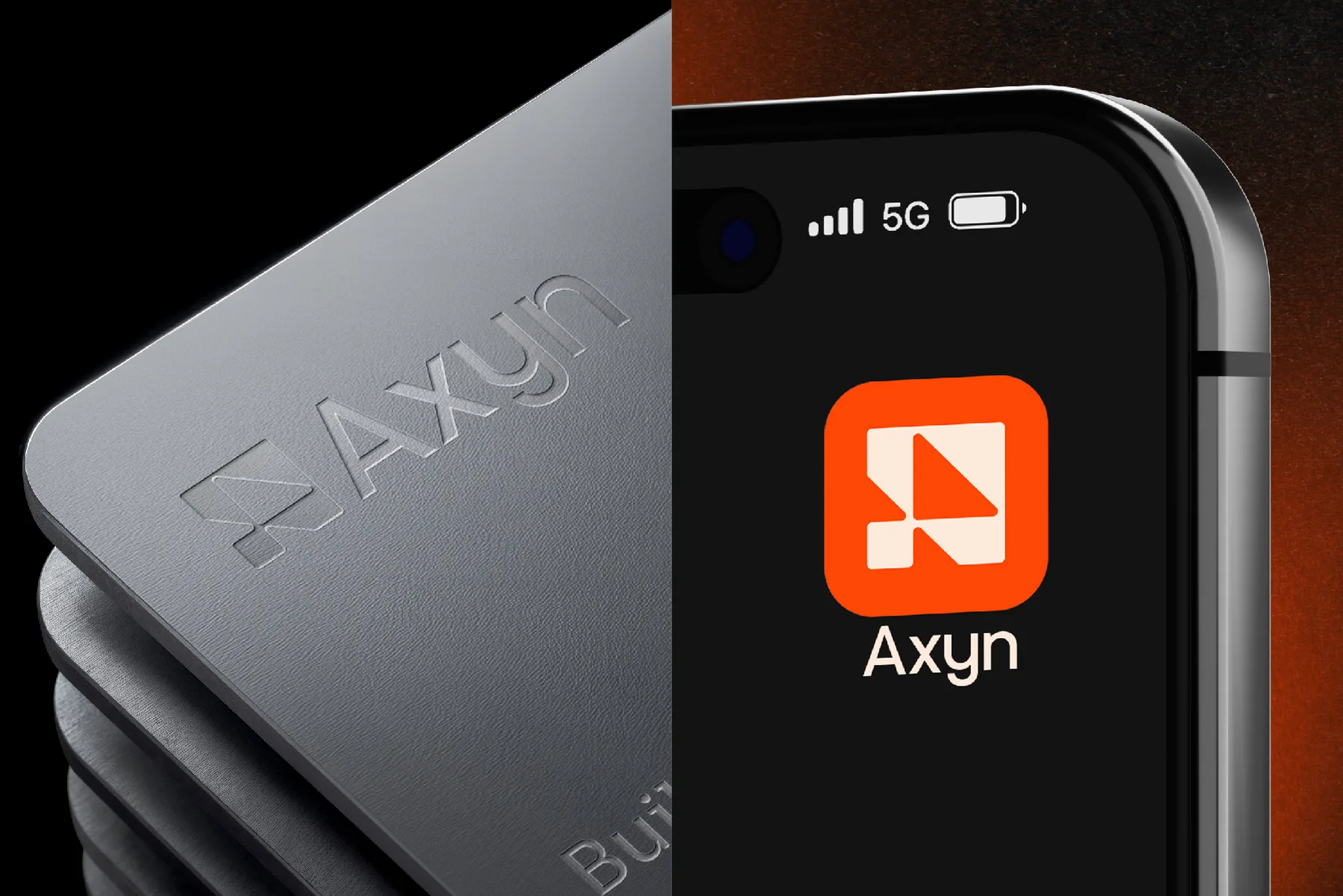
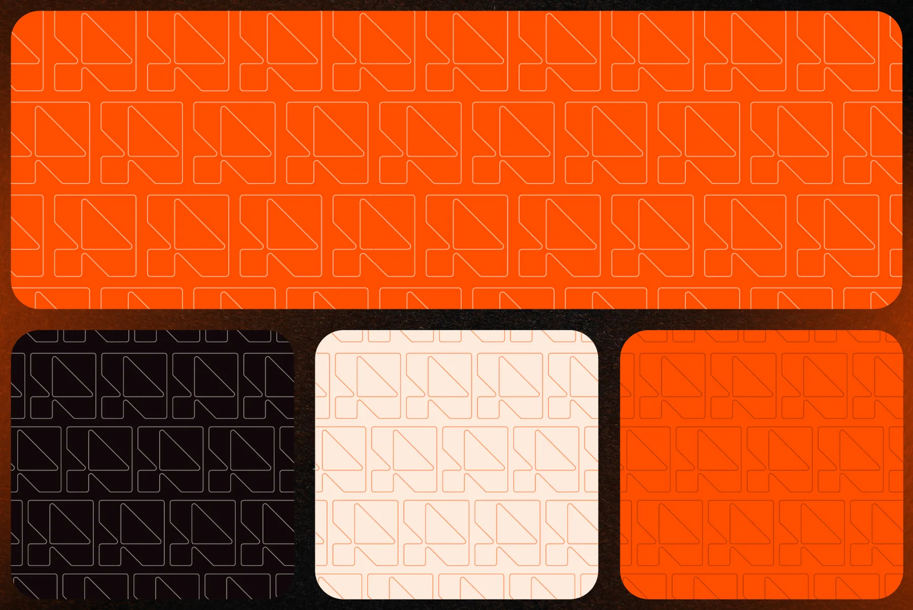
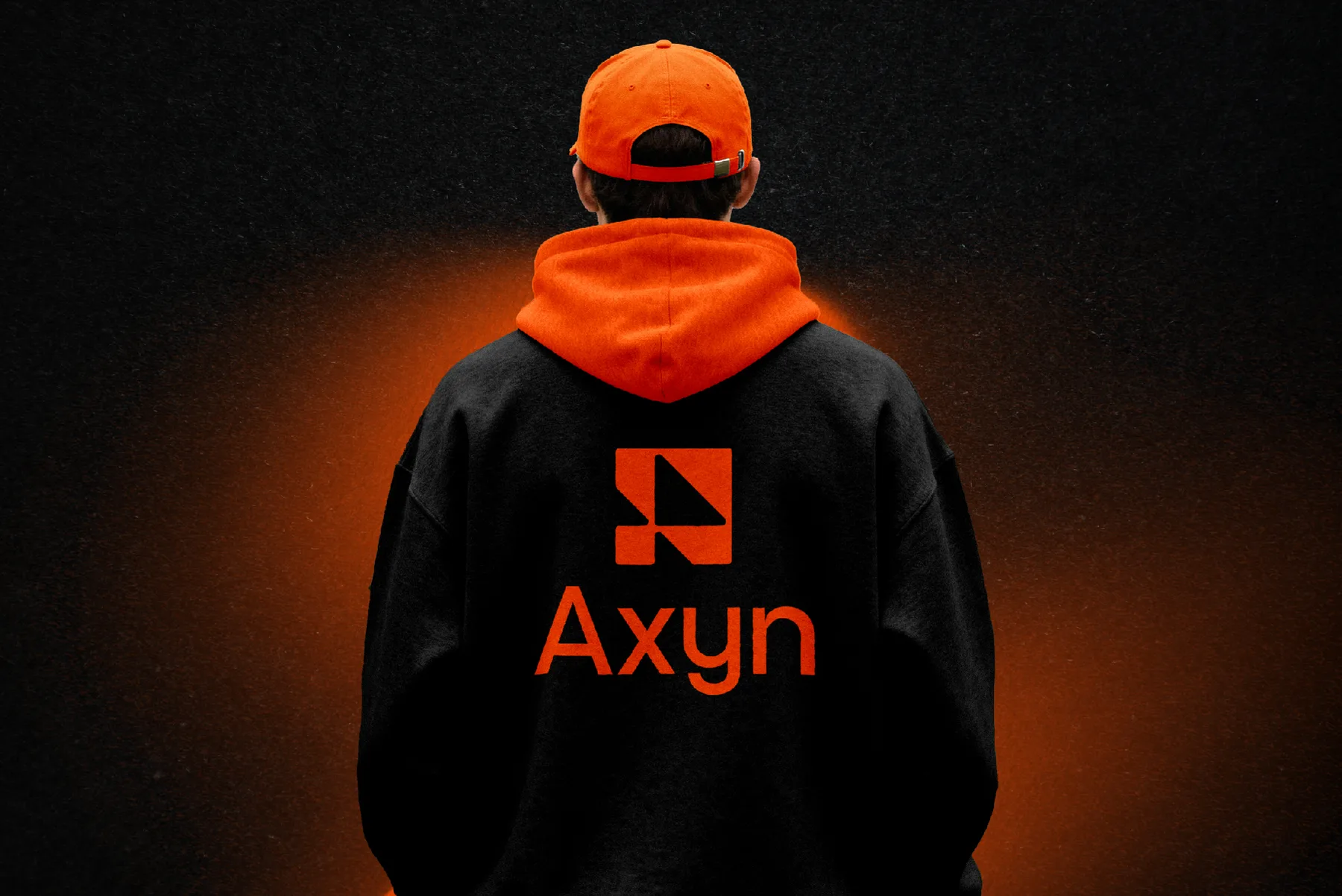
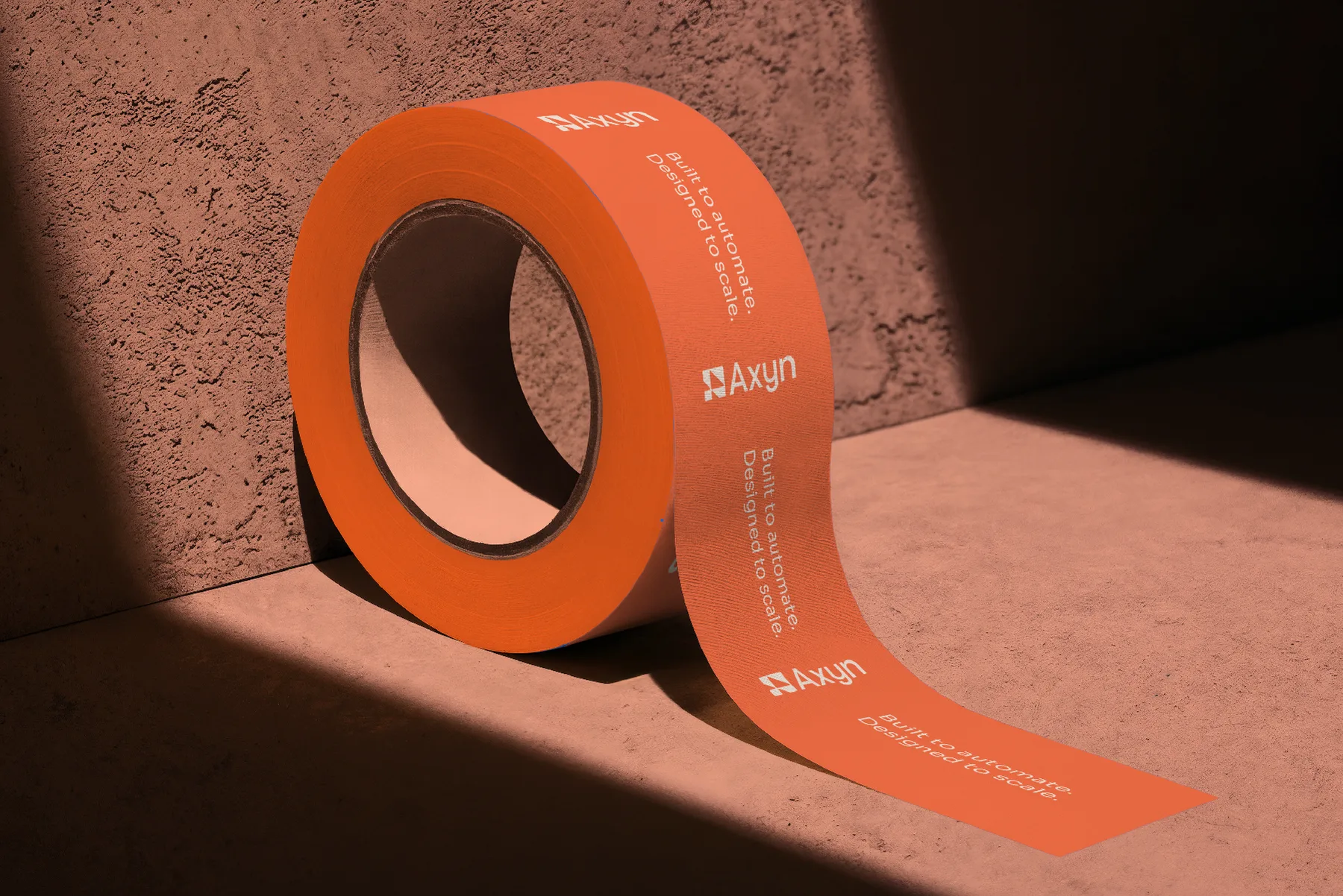
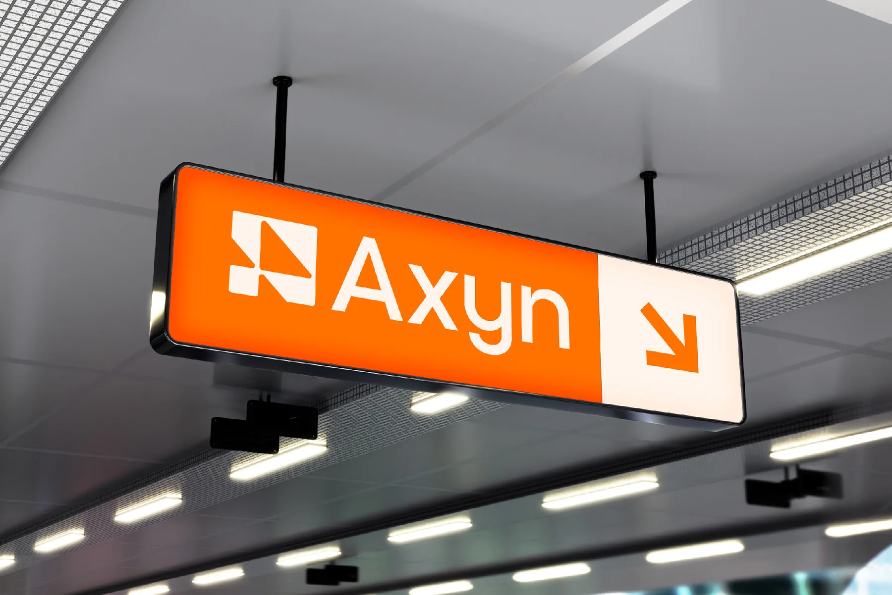
Axyn needed a logo that looked fast and precise without falling back on tired tech-brand clichés. We designed a single geometric arrow mark that also works as a favicon and app icon, paired it with a clean modern wordmark, and built a warm orange, beige and near-black colour palette that stays readable on both light and dark backgrounds. The brand identity system goes well beyond the logo. It covers app icons, ID badges, keychains and other merchandise, a repeating brand pattern, and out-of-home advertising templates, so the visual identity holds up on a phone screen and on a subway platform.