.png)

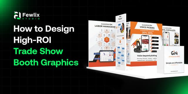
Imagine a large convention hall. Hundreds of booths, thousands of people passing by, and each brand vying for the same three seconds. Think of the last trade show you can remember. It's likely it wasn't the one that had the most flyers or the loudest speaker system. It was the one that looked like something, the one where the graphics spoke before any salesperson had opened his mouth. That's all the game is with trade show graphics. You're not just decorating a room, you're creating a first impression that needs to be made quickly, made hard and make leads, conversations and ultimately sales. Do it right and the booth is paid for many times over. If it's not done right, even a good product becomes a lost cause among unmemorable backdrops. For brands looking for a creative booth design service in USA, the goal should always be to combine attention-grabbing visuals with clear messaging and a strong brand presence.
What Makes Trade Show Booth Graphics Deliver Real ROI
ROI in a trade show has nothing to do with the quality of the booth pictures taken after the event. Whether that design actually translated into actual business results. You can have a beautiful booth and it can still fall flat if it doesn't lead to an action, and you can have a pretty plain booth and it can be spectacular when everything is done with purpose. A few things tend to separate booth graphics that actually generate ROI from the ones that just take up space:
- Instant clarity, so a person walking past understands what the brand does within a few seconds
- A clear focal point, so the eye knows exactly where to land first instead of scanning aimlessly
- Messaging over decoration, prioritizing what the brand wants people to know over what simply looks nice
- Design that supports a goal, whether that's collecting leads, launching a product, or building brand awareness
- Visuals built for the environment, since a busy show floor needs bolder, simpler design than a quiet office wall
Why First Impressions Happen Faster Than You Think
There's no time for looking at anything at a trade show. The people are tired, overloaded and walking past dozens of booths in one afternoon. Research on attention spans in a noisy environment always tells us the same thing – people are only willing to look twice at something within a few seconds. This means that the images on a stand are not allowed to develop a slow build up. No space for a text wall or a clever headline that requires some time to process. It's for this reason that great booth graphics rely on large, bold, and instantly recognizable graphics instead of information. The point isn't to tell you all the details of the company right on the wall. The idea is to stimulate curiosity to the point where someone does stop walking. When they have settled down, then conversations, brochures, and more information can follow. The graphic's sole purpose is to get that moment.
Designing a Visual Hierarchy That Actually Works
Visual hierarchy is a simple design concept, what should be looked at first, second and third. This is more important than just about anywhere else, on a booth, there is no scrolling, no clicking, no second chance to reorganize the information. All content is presented at once – therefore the design must do the organizing. A well thought out hierarchy for booth graphics usually follows a pattern like this:
- The brand name or logo, positioned high and visible from a distance across the show floor
- One strong headline or value statement, answering the "why should I care" question immediately
- Supporting visuals, like product shots or lifestyle imagery, reinforcing the message without crowding it
- Minimal additional text, saved only for details that genuinely need to be there
- A clear call to action, whether it's a QR code, a giveaway mention, or an invite to talk to the team
If these elements are utilized in the right way, it is not the user who has to do any work to understand what the booth is. The layout does the explaining before they come close enough to talk to anyone.
Choosing Colors and Branding That Stand Out on a Crowded Floor
The trade show floor is a noisy place visually. Dozens of booths, back-lit signs, screens and banners all vying for a small amount of space. This is where color selection no longer is a matter of taste, but of strategy. If the design looks good from close range, but the colour palette is the same as the rest of the space, the booth will still blend in with the other stands. A few practical color considerations that tend to make a real difference:
- Contrast against neighboring booths, since colors that clash with the surrounding environment tend to pop more
- Brand consistency, making sure the booth still feels unmistakably like the brand, not a one-off design experiment
- Readability from a distance, choosing color combinations that stay legible even from across the aisle
- Emotional tone, since colors quietly signal energy, trust, luxury, or playfulness before anyone reads a word
Balancing Bold Visuals with Clear Messaging
One thing that's often wrong with booth design is that the graphics are great, but no one passing by knows what the company is. Then there are the other booths that cram too much text and detail into their presence that nobody reads. High ROI booth graphics fall somewhere in between these two extremes, designed to grab attention but not the wrong kind. This usually comes down to a few habits in the design process:
- One core message per booth, resisting the urge to promote every product or service at once
- Short, punchy headlines, over long sentences that require someone to stop and read carefully
- Visual storytelling, using imagery to imply a benefit rather than explaining it in paragraphs
- Consistent typography, so the design feels intentional rather than pieced together
Where a Fewlix Studio Fits Into This Process
What Fewlix is all about is the graphic design aspect of it, the artwork, the layout, the branding, the visual telling of a story that actually gets put on that structure. In essence, it's just a simple concept. The booth design brings the visitors closer to the brand. A design studio like Fewlix is designed to do just that: create graphics that are going to grab people's attention, hopefully get them remembered and spark their interest to learn more. With a focus on strategic visual communication and memorable brand experiences, Fewlix Studio can be a valuable choice for businesses searching for the best visual branding company to bring their trade show presence to life.
Ready to Elevate Your Brand Presence?
Let's collaborate to bring your vision to life with stunning
Book Your Free Consultation