
One of the most useful tools that is underutilized in branding is color theory. Most of the business owners concentrate on logo design and brand message. While they are important, they fail to take into consideration the stronger effect of the colors in relation to customer perception, brand recognition, and business success. As a matter of fact, research indicates that color makes a brand known by up to 80%, yet the major companies pay little attention to their color selection strategy. Your choice of colors does not only have to do with the aesthetics of your business but also has everything to do with your choice as a strategy of how your customers will view your brand, whether they trust you, and, ultimately, whether they will choose you or not based on that choice. In this detailed blog, you will be guided to have the correct brand identity colors that will be authentic and effective in depicting your business, as well as appealing to your target customer base.
The Psychology of Brand Colors
You must know how color psychology works in brand identity design before you begin building your color palette to brand yourself. The art of utilizing colors is to control the customer behavior and emotions, which is the psychology of colors, and it is the key to effective visual branding for business success.
RED
Red brings a sense of passion, urgency, and power. That is why fast-food restaurants and clearance sales often have red in addition to them, which provokes a sense of hunger and gives a feeling of urgency. Red may, though, when used in excess, signify danger or aggression.
BLUE
Blue is a sign of reliability and stability, and being a professional. The most popular color in corporate branding is blue, and Facebook, IBM, and Samsung are some of the companies that use it. Blue is suitable for financial institutions, healthcare providers, and technology companies.
GREEN
Green is a sign of growth, health, and sustainability. It is growing in popularity among environmentally friendly brands and health companies. Green is soothing and promotes the feeling of nature and organic consumption.
YELLOW
Yellow is a sign of hope, innovation, and friendliness. It catches the eye and has a warm and positive touch. Yellow can, however, be too much when used as the dominant color without a balance.
PURPLE
Purple is a symbol of luxury, creativity, and wisdom. Purple is a characteristic used by brands such as Cadbury and Twitch to depict sophistication and imagination.
BLACK
Black is classy, strong, and has class. The color black has become very common in the positioning of luxury brands to portray a message of exclusivity and high quality.
WHITE
Cleanliness, simplicity, and trust are implied by White. It offers space in designs and is part of minimalistic designs. Knowledge of how the color of the brand affects the perception of the customers is essential since the association of color is not random, but it is deeply ingrained in the cultural, psychological, and other human experiences.
Evaluation of Brand Personality and Values
The correct choice of brand color begins with a self-reflection about the basic identity of your company. You are not even considering certain hues, yet you should answer these basic questions: • How do you want your customers to feel about your brand? • Who is your target audience? Colors are reacted to differently by different demographics. • What industry are you in? There are conventions of colors in certain industries. • What are your core values? • Who are your key competitors? Analyze their color choices. To save your time, Fewlix Studios offers custom visual branding solutions through a skilled team of creative professionals and graphic designers who can help build your brand with the perfect color theory and combination that is certain to benefit your business. They help you answer these questions and bring your vision to life with all necessary measures taken for perfect visual branding.
Your Visual Brand Identity Color Strategy
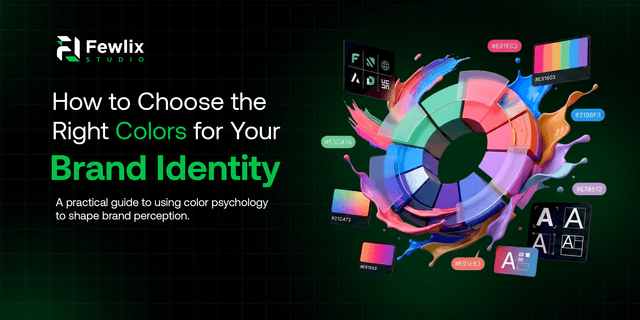
After knowing your brand personality and the psychology of colors, it is time to create a brand color palette for visual identity. The most successful brands have a primary color, secondary colors, as well as colors that serve as an accent color, which are used in a combination of colors.
Primary Color
Your primary color is predominant in your brand. This will normally be included in your logo, main website details, and major promotional documents. Select a primary color that can be used across all mediums that has a very strong response to your brand's core personality and can be used in many applications, both digitally and printed.
Secondary Color
Secondary color helps to back up the primary color and gives variety. They never should work against your main color, but must be used in their complement. An excellent secondary color adds to your visual kit and, at the same time not fall apart.
Color Accents
Color accents also present emphasis and highlight certain features such as call-to-action buttons, important content, or featured content. Colors of accents must provide contrast and direct the attention of the user without making the design too heavy.
Importance of Color Harmony in Visual Design
In creating your brand color palette, take into consideration the color combinations. It is against the ground that the laws of color harmony do not come into the picture: • The complementary colors are positioned on opposite sides of the color wheel (such as blue and orange), and they generate great contrast and brightness. • Color analogies are placed next to one another on the color wheel and bring about harmony and unity. • Triadic colors are well distributed along the color wheel and offer harmony with a high degree of visual effect. • In monochromatic palettes, various shades and tints of one color are used in sophisticated and unified aesthetics.
Conclusion
The type of testing that is done at this stage usually presents some dissatisfaction. You may find out that a color that you thought might be great in theory does not go well with your photography style or that a secondary color causes unintended confusion with your primary color. But all is well as you improve your choices after discovering the flaws.
Ready to Elevate Your Brand Presence?
Let's collaborate to bring your vision to life with stunning
Book Your Free Consultation